Traveling Cow Creamery project overview

Creative and Art Direction
Brand Development and Strategy
Photography Direction
Design

Additional Credits:
Scott Warren, Copy
Jimmy DeFlippo, Photography

The Resort Operations team at Marriott Vacations Worldwide was creating a variety of premium ice cream offerings, including sundaes, milk shakes and floats. All options were crafted using only premium ingredients such as Edy’s® soft-serve ice cream, Sweet Street non-GMO blended cookies and hand-chopped fruit — all topped with quality sauces.

Communication Objective
To entice Owners and guests to indulge in new ice cream offerings during their resort stay.

Audience
Owners and guests staying on property.

Solution/Positioning
Delicious ice cream starts with milk from a cow. Great vacations start by packing your bags and traveling to a desired destination. Marriott Vacation Club combines both to present a menu of new soft-serve ice cream blends at select properties. To infuse a touch of whimsy and reflect the wholesome goodness of these superior sundaes, shakes and floats, Traveling Cow Creamery uses an illustrated cow. Adding travel elements such as stamps and colors associated with a destination/region creates opportunities to imagine stories about the cow’s adventures as she explores delicious soft-serve ice cream blends at select Marriott Vacation Club resorts.

Recommendations
We recommended for the sites to create signature sundaes specific to their destinations or regions, e.g. Key Lime Pie Sundae (Florida), Pineapple Sensation Sundae (Hawaii), Peach Cobbler Sundae (South Carolina), etc.

To generate excitement among associates about the launch of this new brand, a contest would be created to name the cow character.

Offer apparel (hats, T-shirts, etc) and collectible merchandise (such as pins) with Traveling Cow Creamery logo or icon.

Create a passport/game for kids to collect stamps at each destination where Traveling Cow Creamery is available.

Brand Tone
Whimsical, lighthearted, wholesome

Traveling Cow Creamery pieces

Traveling Cow Creamery

The Traveling Cow Creamery logo reflects the whimsical and fun nature of the ice cream industry. I illustrated this playful character to compliment the story about a cow who explores delicious soft–serve ice cream blends at different resorts. I wanted the typography to be lighthearted and to have a resemblance of nostalgic ice cream parlors.

Additionally, I created a responsive logo system, starting with the full logo implementation and ending with the cow character.

Traveling Cow Creamery responsive logos

Once the logo was finalized, I came up with the direction, look and Art Directed the photoshoot. I wanted the photography to reflect three different styles.

Farm — to reflect milk as the main ingredient in ice cream.

Contemporary — to showcase a premium product sold in a modern location.

Nostalgia— to resemble playful ice cream parlors long forgotten.

I achieved this by utilizing rustic textures, clean/modern split color backgrounds and pastel colors.

After the photoshoot and foreseeing the expansion of the brand, I created a Toolkit to be utilized by vendors and other designers. It outlines the brand positioning as well as formatting and rules about colors, typography and so on. Instead of having a generic look, I designed it to look like the rest of the brand. Given the nature of the product and for consistency with the photography I complemented it by designing playful, colorful, modern backgrounds.

Traveling Cow Creamery toolkit

The first piece of advertising introducing Traveling Cow Creamery to the market were a series of posters. I designed them with a combination of the brand colors, original photography and a variety of textures to complement the typography and the products. All of the information and photography is displayed inside cow prints.
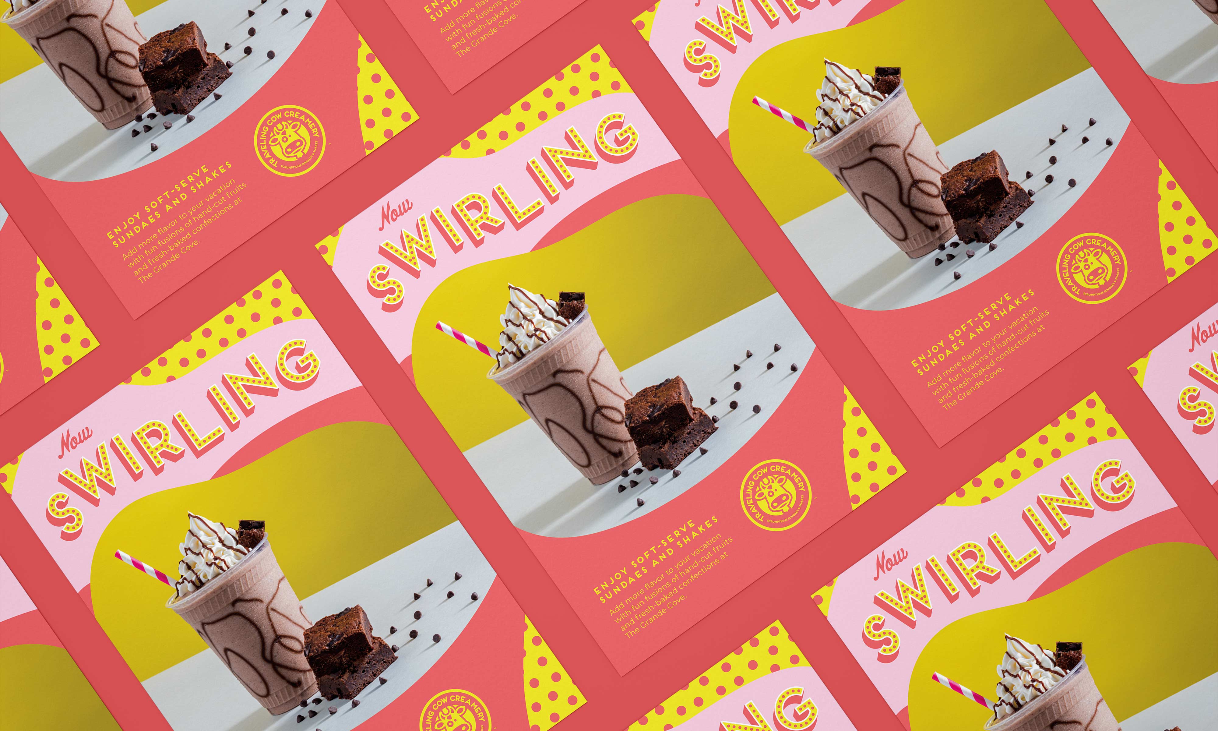
Traveling Cow Creamery Poster
Traveling Cow Creamery patterns

I also introduced a series of cow prints in different colors to be used on cups and apparel. I expanded the original color palette to match some of the logos shown below.

Traveling Cow Creamery cups

These three additional logos were originally created to represent different regions where the products were going to be sold. The current vision is to use them on different apparel and to match new color combinations on collateral. With that in mind I also designed additional versions as well as adding a mailing stamp to some of them to play off the "Traveling" in the name.

Traveling Cow Creamery region logos
Traveling Cow Creamery logos
Traveling Cow sign
Traveling Cow Creamery tote bags

The merchandise started with the yellow hat being the one worn by the employees. From there I designed a variety of apparel to be sold on–site including tote bags, hats, tank tops and t-shirts.

Traveling Cow Creamery employee hat
Traveling Cow Creamery hats
Traveling Cow Creamery apparel