GEMS — Gilbert Exposition Management Services

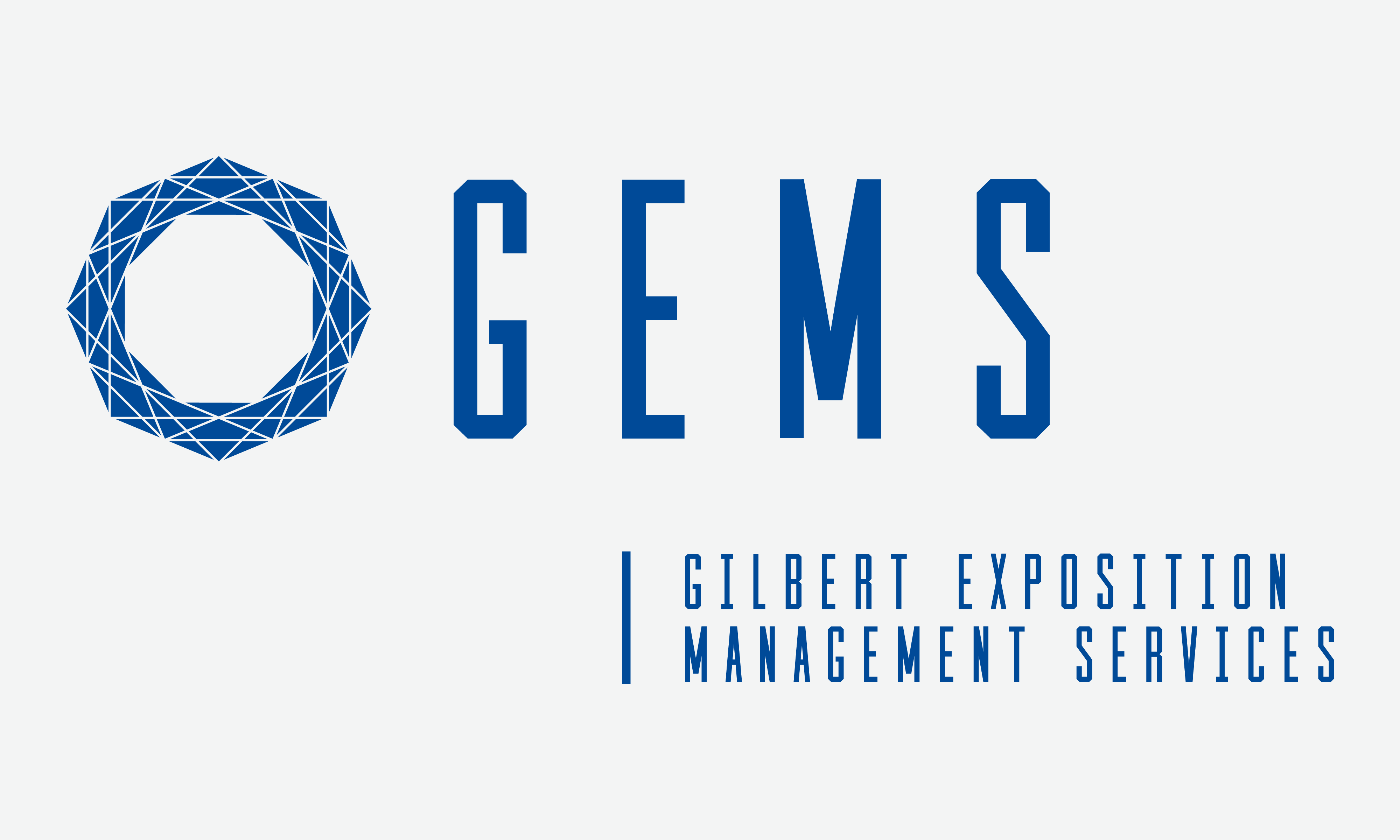
The first execution of the rebrand was the color palette, typography and the logo. I kept the main color (blue) and added two complementing colors. I also decided to keep the diamond since it had been used from their beginnings, however, I redesigned it to be cleaner, contemporary and unique in an effort to set it apart visually. I also got rid of the script typography and redesigned it to feel stronger and industrial since it is the nature of their industry. Finally, I created a responsive logo system to accommodate different usages and space restrictions.


After finalizing the colors, typography and the logo; I designed one texture and one pattern background in an effort to add visual appeal to their pieces. The texture is a representation of the different shades in a diamond and the pattern is the icon in their logo. Finally, I set the standard for one element to always be slanted complementing the brand look and feel. The first use of the texture was on their business cards and the pattern on the packing tape.


GEMS requested the design of an ad template that they could send to potential clients as an email attachment. For consistency, I decided to incorporate the “diamond shades” texture and utilize one of their responsive logos to better fit the space. Additionally, I designed a batch that they could use during their shows in order to create a more professional and unified presence.

Wardrobe was another area that needed attention. I came up with the idea of having a non–floor staff in a lighter color and a floor staff in a dark color since they get dirty while working. Furthermore, by creating these complementing colors sets, it helps their clients and general public to quickly distinguish one team from the other. In addition, for the floor staff, the polos are worn by the supervisors and the t–shirts by their manual workers.


Since GEMS containers travel to many destinations across the county, I also designed their containers to reflect their brand as well as serving as an additional vehicle for advertising.

To complete their new look, I redesigned and developed their website. I worked with a writer to communicate with a simple, clear and concise language and to make the copy SEO optimized. I also added a portfolio section for GEMS to easily display their work. I used WordPress as the backend and gave the client training on how to update their web content.

